Working with analysis data
Published 03 December 2012

The Analysis page charts performance data for monitored servers and databases. You can display graphs containing data points that represent points in time when performance data was collected
To view an analysis graph
- Choose the performance metric you want to plot from the Show drop-down list. Metrics are grouped into Machine, SQL Server, and Database categories.
- Select the object to plot from the For list.
For some types of metric, you can plot all the objects together. The example below shows Machine: processor time for all machines in the clusters on the selected server.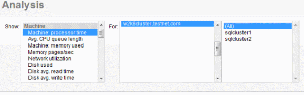
- Choose a time range. By default, the graph shows the last 10 minutes, but you can select a different fixed value from the Time range drop-down list.
- To specify a particular time range, click the Set custom time range icon
 and enter the start and end time.
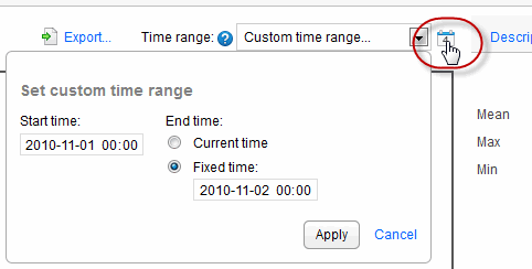
Viewing values on the graph
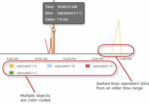
Each graph line represents the performance of a selected object. SQL Monitor plots up to a maximum of 500 data points on each graph and draws straight lines between consecutive points. For short time ranges (less than 10 minutes) the graph displays fewer data points. For longer time ranges, more data points are displayed, so that these graphs can still provide a detailed overview of changes in values. Move your mouse pointer over a line on the graph to view a tooltip showing the time, object and value at that data point.
If you are comparing data for different time ranges, the graph line for the older time range is displayed as a dashed line. If you are comparing data for multiple objects, a color-coded key is displayed below the graph.
Viewing statistics
Click the Statistics tab to the right of the graph to display the mean, maximum and minimum performance counter values for the selected time range. If you're comparing data at different time ranges, the difference between each value is also displayed.
Exporting the data
Click Export... to open or save performance data as a .csv file for the object and time range specified. This means you can record object data for use in reports on performance metrics. The export.csv file contains:
- the name of the selected performance counter and host machine.
- the type of value displayed if this doesn't form part of the performance counter name, for example, bytes, milliseconds or percentages.
- a column containing the date and time of every data point displayed on the analysis graph. The time is displayed as Coordinated Universal Time (UTC).
- columns containing details of every data point for each selected object.
Note: If necessary, you may consider adjusting the UTC times displayed in the file according to the time zone in which your servers are located.
Finding more information about performance counters
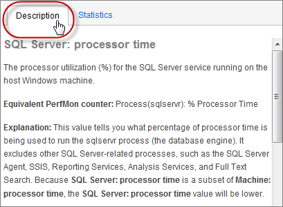
Click the Description tab to the right of the graph to display detailed information about the selected performance counter, including:
- the name of the equivalent PerfMon counter
- an explanation of what this performance counter measures
- guidelines for acceptable values, and values that may suggest a problem with your object
- related performance counters that should also be checked
- suggestions for solutions to problems caused by unacceptable values
- links to articles or white papers containing additional information
Not enough data to plot one or more items?
Data cannot be plotted on the graph for the time range selected for the following reasons:
- there aren't enough data points on the graph; there must be at least two data points for plotting to take place. The frequency of data points depends on the counter and time range selected, for example, if Last 10 mins is selected for Machine: processor time, data points are plotted at 15 second intervals. Plotting is less frequent for some other counters and for certain longer time intervals.
- data for that time range has been purged
- servers had not been added to the Monitored servers page, or monitoring was paused
If data cannot be plotted, a blank area is displayed on the graph.
This documentation contains proprietary information and is protected by copyright law.
Copyright © 2026 Red Gate Software Limited. All rights reserved


