Finding additional metric information
Published 25 July 2013
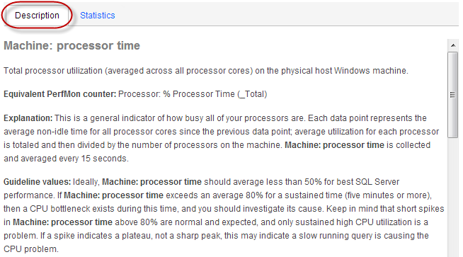
Viewing descriptions
Click the Description tab to display detailed information about the selected metric, including:
- the name of the equivalent PerfMon counter where applicable
- an explanation of what this metric measures
- guidelines for acceptable values, and values that may suggest a problem with your object
- related metrics that you may want to add to the graph
- suggestions for solutions to problems caused by unacceptable values
- links to articles or white papers containing additional information
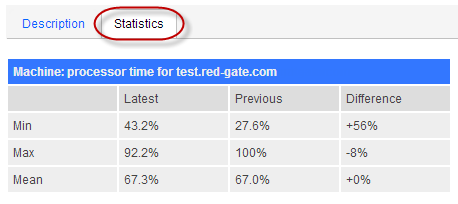
Viewing statistics
Click the Statistics tab to display the mean, maximum and minimum performance values for the selected metric and time range.
If you're comparing data at different time ranges, data for the latest time range is displayed alongside combined values for earlier ranges. The differences between the latest and previous time range values are also displayed:
Exporting the data
Click  Export... to open or save metric data as a .csv file for the object and time range specified. This means you can record object data for use in reports on performance. The export.csv file contains:
- the name of the selected metrics and host machines.
- the type of value displayed if this doesn't form part of the metric name, for example, bytes, milliseconds or percentages.
- a column containing the date and time of every data point displayed on the analysis graph. The time is displayed as Coordinated Universal Time (UTC).
- columns containing details of every data point for each selected object.
If necessary, you may consider adjusting the UTC times displayed in the file according to the time zone in which your servers are located. You may also want to change the format of this column to display the time as ##:##:## so you can see more precise collection times.
If you export from the baseline Regions view, the data in the .csv file is split across five columns. The first column contains data for the most recent time range. The remaining four columns relate to previous data and contain the minimum and maximum values, together with data from the 25th and 75th percentile which the darker shaded region represents. All data is smoothed, so minimum and maximum values may not match exact values.
This documentation contains proprietary information and is protected by copyright law.
Copyright © 2026 Red Gate Software Limited. All rights reserved


