Different values displayed for the same data points on the Analysis Graph
Published 08 March 2018
If you look at a specific point on a graph showing 10 minutes of data, then look at the exact same data point on a graph showing 24 hours of data, you may see a different value. For example, the first graph below shows machine processor time as 68.9% at 12:57:19PM, but the second graph displaying a longer time range displays the value as 74.1% for the same data point:
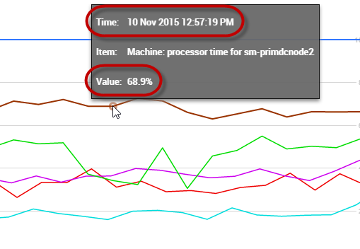
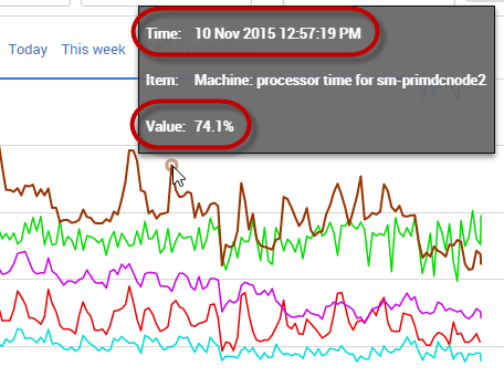
The difference is because some of the values for the longer time period have been aggregated, while others haven't been included. The specific data point you're interested in now contains a summary of other points in close proximity. This form of data sampling makes sure that whatever the time range displayed, peaks and troughs are maintained on the graph relative to each other, so you don't miss anything important. If you're interested in seeing the most accurate values for a specific data point, use data points from a shorter time range.
This documentation contains proprietary information and is protected by copyright law.
Copyright © 2026 Red Gate Software Limited. All rights reserved


