Using a baseline for comparison
Published 28 March 2024
Once you've displayed the metric activity you're interested in, you can compare it with what was happening during earlier time ranges to identify unusual patterns of behavior.
Baseline: comparing a single time range
Use the Compare baseline button to compare performance activity with a single earlier time range of the same duration. The earlier time range is set as the baseline.
To change the duration used for comparison, select from the Time range drop-down list. The dates and times of the baseline are updated accordingly, but you can also change them using the Compare with drop-down menu, date/time pickers.
You can also set a custom time range by using the mouse wheel to zoom in and out of the graph.
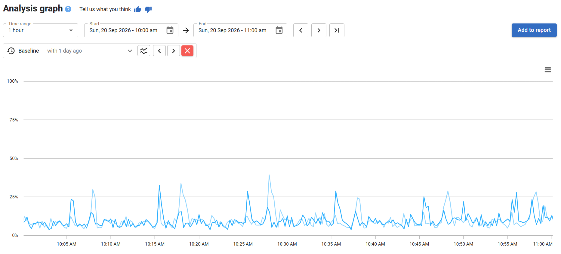
In this example, data collected between 10am and 11am is compared with the same hour 24 hours earlier. Each hour is shown as a line on the graph, with the earlier time range displayed in a lighter shade:
Baseline: comparing multiple time ranges
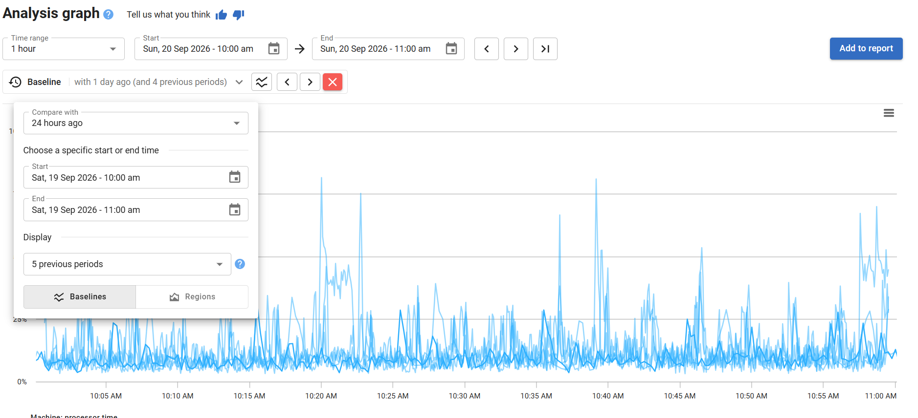
After comparing with a single time range, you can add up to 10 previous time ranges to the comparison. Open the baseline options and use the drop-down list under Display to choose how many periods to show.
Redgate Monitor can only show data that's currently stored in the Data Repository. Data from an earlier time range can't be included in the baseline if it's already been purged, if the object you're monitoring was unavailable or suspended, or if Redgate Monitor wasn't running at that time.
Each time range shows data collected during the same duration and at the same frequency as the original baseline comparison. In this example, the baseline is extended to include five previous time ranges. The graph that already showed the hour of data collected between 10am and 11am compared with the same hour 24 hours earlier now shows data for the same duration on each of the previous 5 days:
The faintest line displayed represents the time range furthest back in time: the stronger the line, the more recently that data was collected.
Showing lines or regions
Open baseline options to switch between lines or regions.
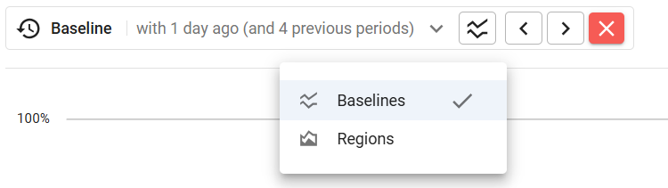
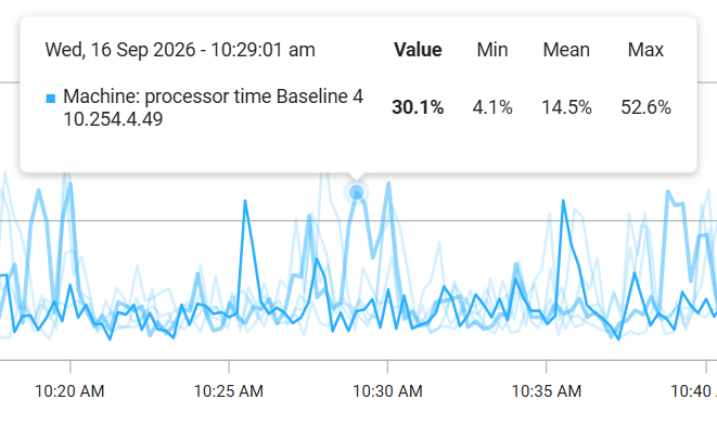
The lines view is displayed by default; this makes it easier to compare individual data points across time ranges.
Move your mouse pointer over a data point to check the exact time at which the value was collected.
Click Regions to compare the latest time range against lines aggregated into shaded areas. The regions show where metric activity took place between the minimum and maximum data values reached, and make it easier to spot the most common areas of activity:
- The darker region shows where half of all metric activity was concentrated.
- The lighter regions show the remaining metric activity spread over areas where it occurred less frequently.
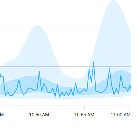
Redgate Monitor ranks the total number of data points into different groups:
- The lighter region at the bottom of the graph contains the lowest 25% of data (up to the first quartile or 25th percentile).
- The darker region contains the data between the first and third quartiles or the interquartile range (between the 25th and 75th percentile).
- The lighter region at the top of the graph contains the highest 25% (between the 75th and 100th percentile).
This documentation contains proprietary information and is protected by copyright law.
Copyright © 2026 Red Gate Software Limited. All rights reserved


