Global Dashboard
Published 07 October 2020
The Dashboard tiles
The purpose of the Global Dashboard is to provide users with a summary view of all monitored servers. This dashboard is most effective when servers are arranged into logical Server Groups. It displays a matrix of tiles, arranged into your defined Groups.
Each tile represents a monitored SQL Server instance. Tiles are displayed on the Global Dashboard only for those machines that host a SQL Server instance; if you monitor machines with no installed instances, you won't see them here (but you will see them in the Alert Inbox and elsewhere). The tiles are color-coded to show the current severity of the most severe or recent alert associated with each server, and they update every 5 seconds. If machines host multiple instances, there will be a tile for each instance.
The following screenshot (from monitor.redgate.com running version 11.1) shows 14 instances grouped by server group. Some of the groups are collapsed, and the health bar indicates the health status of the instances within the group.
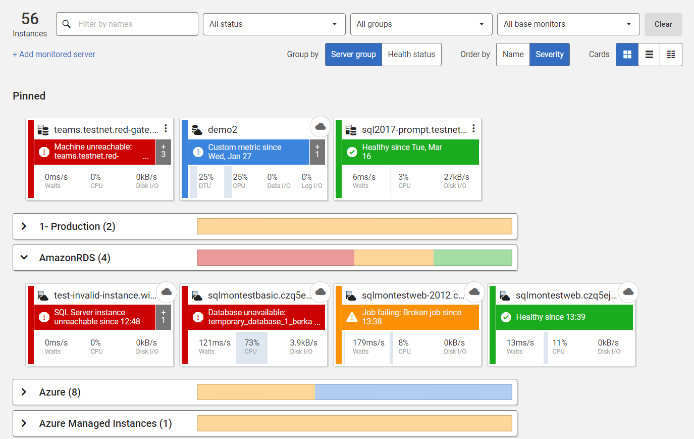
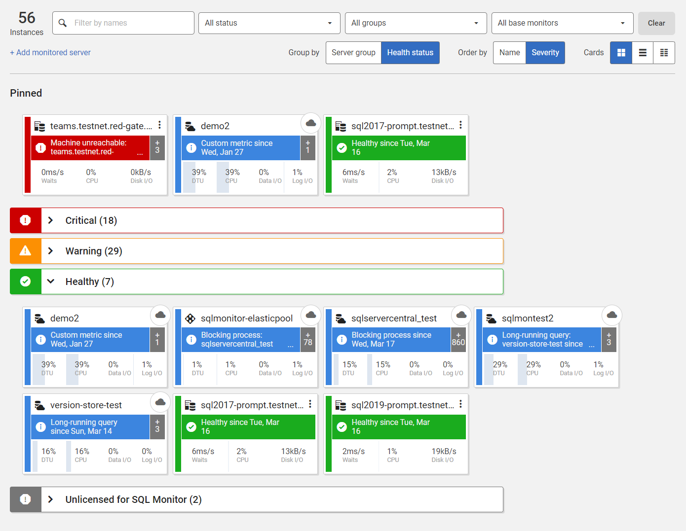
Starting with SQL Monitor version 11.1, it is also possible to group instances by their health status:
Machine and instance name
The top band of each tile shows the name of the host machine and SQL Server instance, typically in the machine\instance name format.
However:
- for Azure SQL Databases and SQL Elastics Pools, it displays the name of the database or pool.
- if the machine hosts a default SQL Server instance, the tile displays the name of the machine (or the name of the node, if it's part of a cluster).
If you click on the name of the instance, you'll go to its Server Overview page.
The top-right corner of each tile displays different icons to represent different categories of server (Azure Machines, Azure SQL Databases and Elastic Pools, Availability Groups, and so on).
If you click on the ellipsis in the top right, sometimes hidden under the icons, you can navigate to the Server Overview page for the instance, or to the Overview page for Availability Groups and clusters (see Pinning tiles and navigating to Overview Pages).
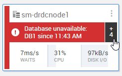
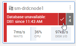
The middle band of each tile gives an indication of the recent "health" of each instance. It shows the most severe current or recent alert type raised on an instance, with each tile color-coded red (high-severity alert), amber (medium-severity alert), blue (low-severity alert) or green (no alerts) and so making it easy to see which instances require immediate attention. If the server is part of a cluster, the tile also shows alerts for the cluster and its nodes, and if it is the primary for an availability group, it shows alerts for that availability group.
The dashboard shows active continuous alerts, and event alerts that occurred within the last 15 minutes. It updates automatically every five seconds.
If you click on the hyperlinked name of the currently displayed alert, you will navigate to the Alert Details page for that alert.
If there is more than one active alert, you will see +n in the right-hand section of the alert band. Click that, to go to the Alert Inbox (filtered for this instance).
To clear the alert, move your mouse over the alert description and click the checkmark.
Recent server activity
The lowest band of the tile shows a snapshot of waits, CPU consumption and disk I/O (reads and writes) in the last 15 minutes.
Move your mouse over the statistics to see a stacked graph showing a breakdown of the relevant metric:
Waits
Signal vs resource.- CPU
Instance vs machine. Disk I/O
Reads vs writes.
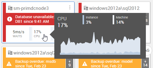
If you click anywhere in this lower band you'll go to the Server Overview page for that title.
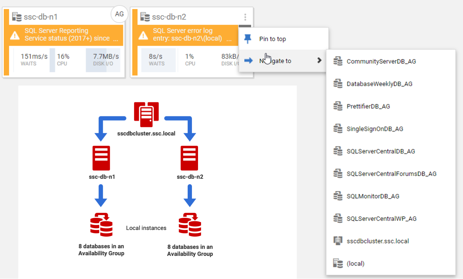
Pinning tiles and navigating to overview pages
Use the  icon at the top right of every tile to see more actions:
Pin to top
Pinning a server means it will appear in a "Pinned" group above any other groups.- Navigate to...
Drill down to an overview page for a different level – cluster, availability group, etc.
The Navigate to... option is useful if the tile represents an Availability Group instance installed on the node of a cluster. The following diagram shows two tiles at the top, as they appear on the Global Dashboard, and below them an illustration of the 2-node cluster that they represent, which hosts 8 Availability Groups (1 database per AG).
Filtering and ordering the Global Dashboard
At the very top of the Global Dashboard, we see the number of SQL Server instances registered within SQL Monitor and we can filter and order the tiles by various means.
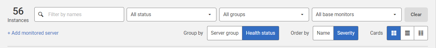
You can filter the tiles by:
- Name – this includes instance name, cluster name, machine name, elastic pool name, display name (alias), as well as database names. It's possible to filter by multiple names by separating them with whitespace.
- Instance status – for example, to focus on those that have recent high severity alerts.
- Groups – to focus on specific groups, such as the Production group, or to find any uncategorized instances.
- Base monitors – by default the page shows the SQL Server instance for all Base Monitors. This is visible only if more than one base monitor is used.
You can also order the tiles by Severity or Name. By default the leftmost tile in any group is the one that has the most severe recent alert.
At the very right-hand side, if you have a very large number of instances, you can switch to a grid view of much smaller tiles.
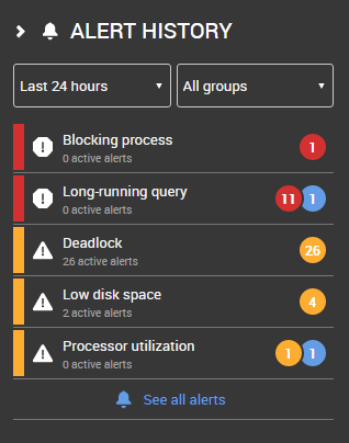
Alert history pane
The alert history pane on the right side of the dashboard shows recent alerts. You can click through to the Alert Inbox, filtered by alert, or to the main Alert Inbox.
Next step
This documentation contains proprietary information and is protected by copyright law.
Copyright © 2026 Red Gate Software Limited. All rights reserved


