Activity Graph and Snapshot Metrics
Published 17 August 2020
At the top of the Server Overview page is the interactive activity graph, which plots the machine metrics (CPU, Memory, Disk I/O) and SQL Server waits against an interactive timeline (x-axis). We can add baseline comparisons to the graph, in order to detect whether any of these metrics are behaving unusually.
The x-axis timeline is marked automatically with any alerts that fired during the displayed period (color-coded to indicate the severity of the alert). Via the PowerShell API, we can also annotate it with details of specific "events" that occurred on the instance, such as when a deployment occurred, or an ETL operation ran, and so on. The graph has a calendar and a focus window, with "grab bars" to expand and contract it to the required period of investigation. When you do so, the metric graphs you see as you scroll down the page will automatically update to reflect activity over the period determined by the graph.
The activity graph remains fixed in place and visible as you scroll down the page, making it easy to correlate the alerts, events and resource-use patterns over that period, with all the metric graphs, lists and properties that follow. Clicking on any metric graph automatically loads that metric onto an Analysis graph, for you to compare its behavior to other, related metrics.

(1) Page Navigation
Hover over an area to bring up the navigation panel to jump to Server/Host Metrics, SQL User Processes, Availability Groups (when set up), Processes, Error Log or Databases.
(2) Server Selector
Change to view information on your other Monitored Servers from the drop-down list.
(3) Interactive Graph
The graph displays CPU, Memory, I/O use on the server, and SQL Server Waits, over a selected time period, by default the last 24 hours. The time period shown can be changed to the last 6, 12, or 24 hours, 2 days or 3 days.
Each of these metrics can be turned on or off using the tick boxes. A baseline for an individual metric can also be displayed via the baseline checkbox/drop-down. The baseline represents the last 7 time periods that the graph is currently set to. So if the time period is set to "Last 24 hours", the baseline will represent the previous 7 days of data.
The “Focus Window”, by default the last two hours in a 24-hour period, determines the period for which all subsequent data on the Server Overview page is displayed. If you want to focus on a particular period, such as when an alert occurred, simply click on that point on the timeline and the focus window will be placed at that point. If you want to select a shorter or longer time period, you can drag the focus window to the area of the graph you are interested in (the shortest time period is 15 minutes).
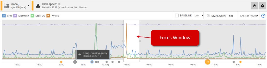
When an alert is raised, a small circle appears along the bottom of the graph. Hovering over the circle brings up a summary of the alert, and clicking on it brings up the details in the Alerts Panel (see (6), below). Similar alerts occurring at the same time are grouped together and a number will appear in the circle indicating the number of similar alerts raised.
SQL Toolbelt deployments (such as by SQL Compare) are also displayed on the timeline by default, and using the SQL Monitor PowerShell API, you can annotate the timeline with various other server events, such as when a SQL Server Update was applied.
(4) Snapshot Metrics
The graphs of the individual CPU, Disk I/O and Memory metrics, and wait statistics, correspond to the time period selected in the Focus Window above.
For Azure SQL Server databases, these graphs will display DTU, CPU, Data IO and Log IO.
(5) Go back in time
Use the Back in Time feature to see the state of your data at some point in the past.
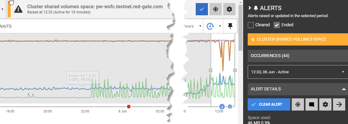
(6) Alerts Panel
The panel displays alerts that were raised in the time period selected by the Focus Window. Clicking on the alert will bring up the details and alert description. From here you can clear the alert, add a comment, configure the alert or go to the full details of the alert.
The Alerts Panel can be hidden by clicking on the Alerts “bell” icon  .
.
The alert pane at the top, to the right of the server selector, shows the most recent active alert. Click on the tick to clear it, or the target to move the focus window to that alert, and bring up its details in the right-hand alert panel, or the cog to go to the configuration page for that alert type.
Next step
This documentation contains proprietary information and is protected by copyright law.
Copyright © 2026 Red Gate Software Limited. All rights reserved


