Displaying metrics on the analysis graph
Published 28 October 2013
You can display multiple metrics in the analysis graph simultaneously. This can help show whether the performance of one metric has an impact on others, and identify performance correlations over time.
- From the Show list, choose the performance metric you want to plot. Metrics are grouped into Machine, SQL Server, Database and Custom metric categories.
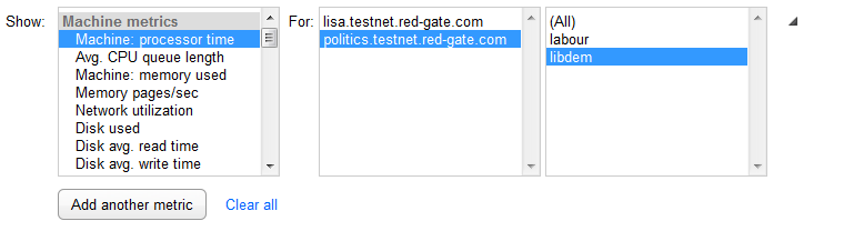
From the For list, select the object to plot
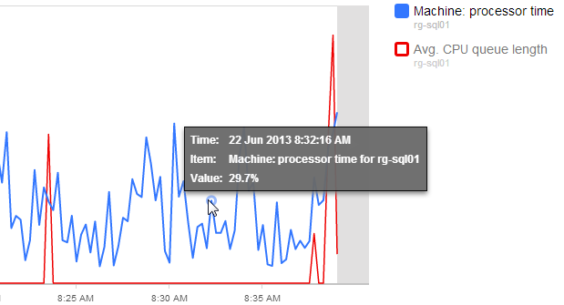
For some metric types, you can plot all the objects together. This example shows Machine: processor time for one of the machines in a cluster:
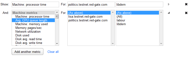
To display another metric on the same graph, click Add another metric.
By default, the next metric in the list is selected. The For lists display to confirm they're using the same objects as the metric previously selected, but you can choose a different metric or object. In this example, we've added Avg. CPU queue length for the same machine in the cluster as the Machine: processor time metric:
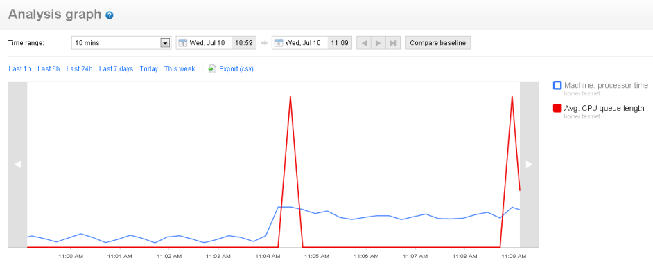
A color-coded key to the metrics is displayed to the right of the graph:
- Repeat step 3 until you've displayed every metric you're interested in.
To edit an existing metric selection, click the Show or For text box to automatically expand the drop-down lists, or click the Expand button  at the end of the row.
To remove a metric from the graph, click the Remove metric button  at the end of the row.
To display the Edit custom metric wizard for a selected custom metric, click the Edit custom metric  button at the end of the row. For more details, see Editing a custom metric.
Changing the time range
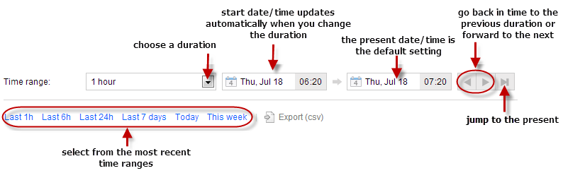
By default, the graph displays data for the last hour. You can change the time range using the time controls above the graph: the drop-down menu, the date/time pickers, and the paging buttons. You can also use the quick links below these controls to select a time range immediately before the present time.
You can also:
- zoom in and out using the mouse wheel
- click and drag the graph left and right
- pan around using the panning arrows on the left and right of the graph
You can't zoom with the mouse or click and drag in IE7 and 8.
Viewing values on the graph
Each graph line represents the performance of a selected object. SQL Monitor plots up to 500 data points on each graph and draws lines between consecutive points. For short time ranges (less than 10 minutes) the graph displays fewer data points. For longer time ranges (greater than 45 minutes), data is aggregated to make sure peaks and troughs are maintained on the graph relative to each other, so you don't miss anything important.
To view the time, metric, object and value at a data point, move your mouse pointer over a line on the graph:
If you're comparing data for different time ranges, the line for the older time range is displayed in a lighter shade.
This documentation contains proprietary information and is protected by copyright law.
Copyright © 2026 Red Gate Software Limited. All rights reserved


